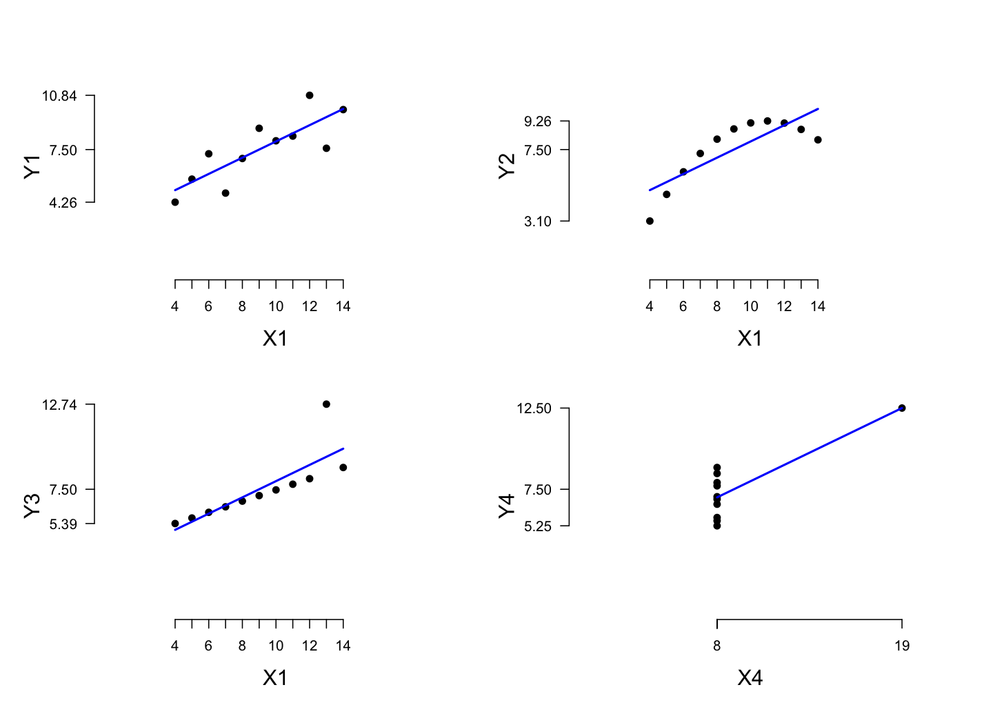
Figure fig:tufte
Anscombe’s Quartet
(Anscombe 1973),
via Tufte
(2001): four dramatically different data-sets with
the same mean (7.50), standard deviation (2.03), and
least-squares fit (3 + 0.5x).
This section focusses on sentiment summarization via visualization. While there is work on textual sentiment summarization, I think high-level visual summaries are better in this area. Any linguistic summary will leave out important nuances of the original source texts, which could be misleading. Of course, visual summaries can make such mistakes too, but we expect them to be high-level and approximate, so we are less likely to be misled.
The central online demos all summarize their results visually in addition to providing numerical information:
It's often the case that a visualization can capture nuances in the data that numerical or linguistic summaries cannot easily capture. Figure fig:tufte is a famous example involving datasets that might be summarized in the same way but nonetheless have very different properties.
Visualization is an art and a science in its own right, so I cannot hope to do justice to it here. The following advice from Tufte (2001, 2006) is easy to keep in mind (if only so that your violations of it are conscious and motivated):
And some basic experimental evidence concerning effective visualization:
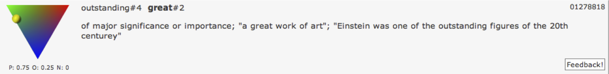
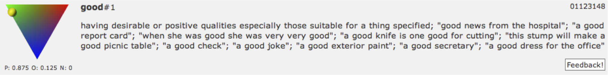
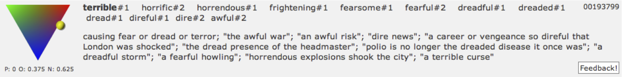
The online interface to SentiWordNet uses colored triangles to place words in a space defined by positive, negative, and neutral sentiment (figure fig:sentiwordnet).


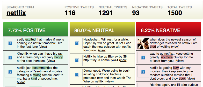
Twitter Sentiment uses Google Charts to summarize its search results, and it also provides the raw data so that users can probe more deeply (figure fig:twittersentiment).

Twitrratr blends the data and summarization together (figure fig:twittrratr).
We Feel Fine aggregates enormous amounts of data and then visualizes the results for strings of the form we feel X (figure fig:wefeelfine).
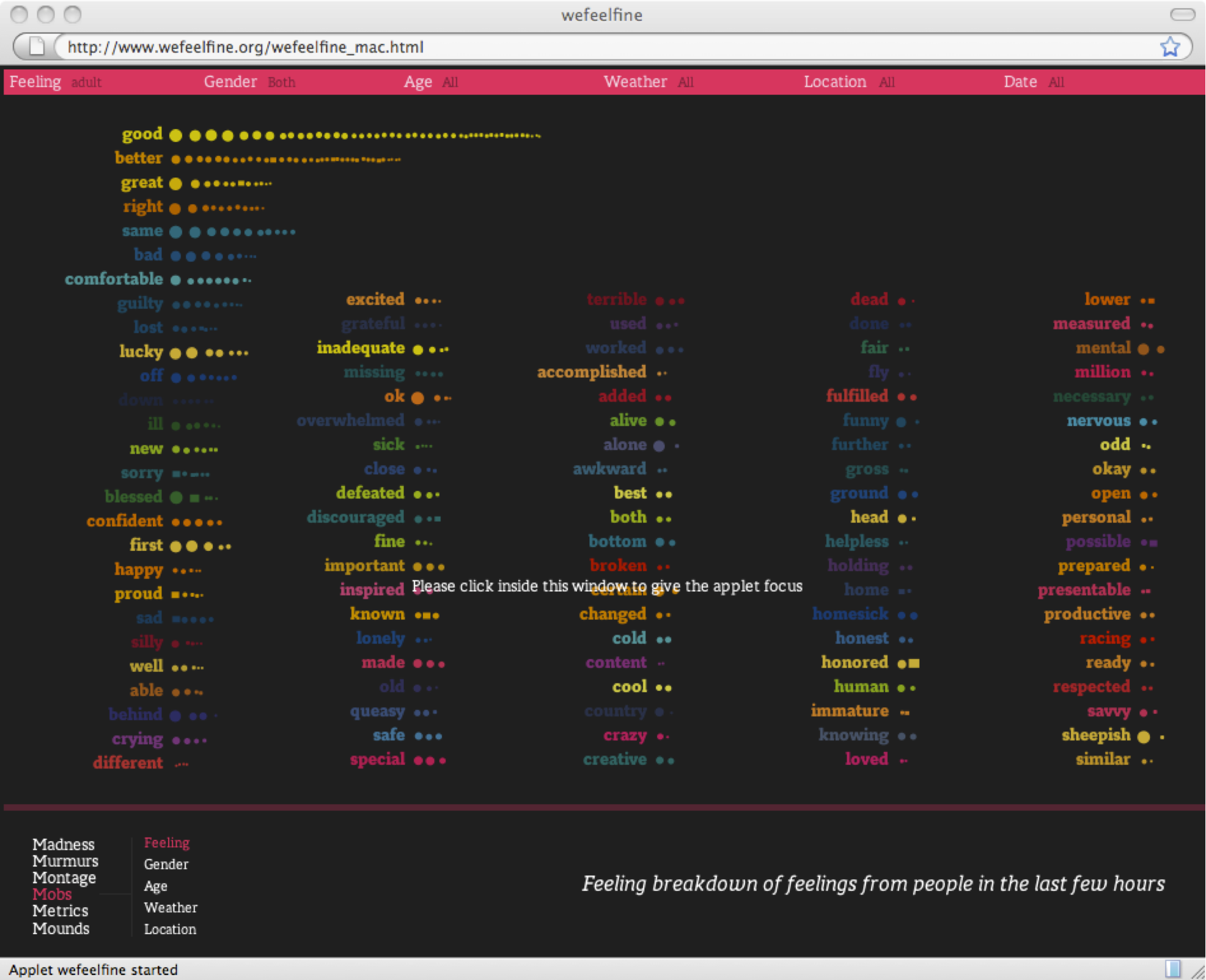


Figure fig:ep2d uses the t-SNE algorithm to embed a very high dimensional lexicon into a 2d space.
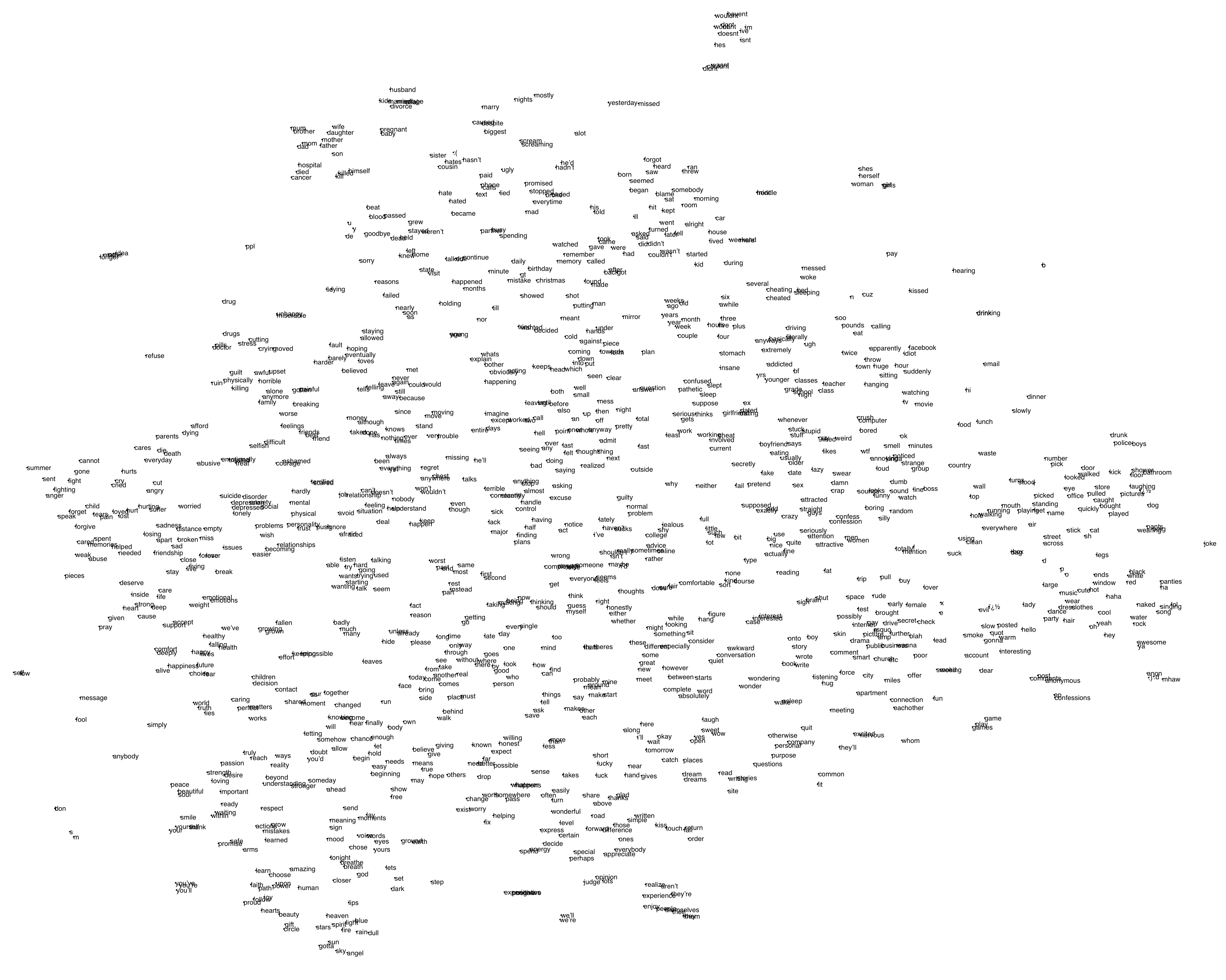
Figure fig:imdbep visualizes scores derived from the IMDB and Experience Project websites using the methods described in the lexicons section.

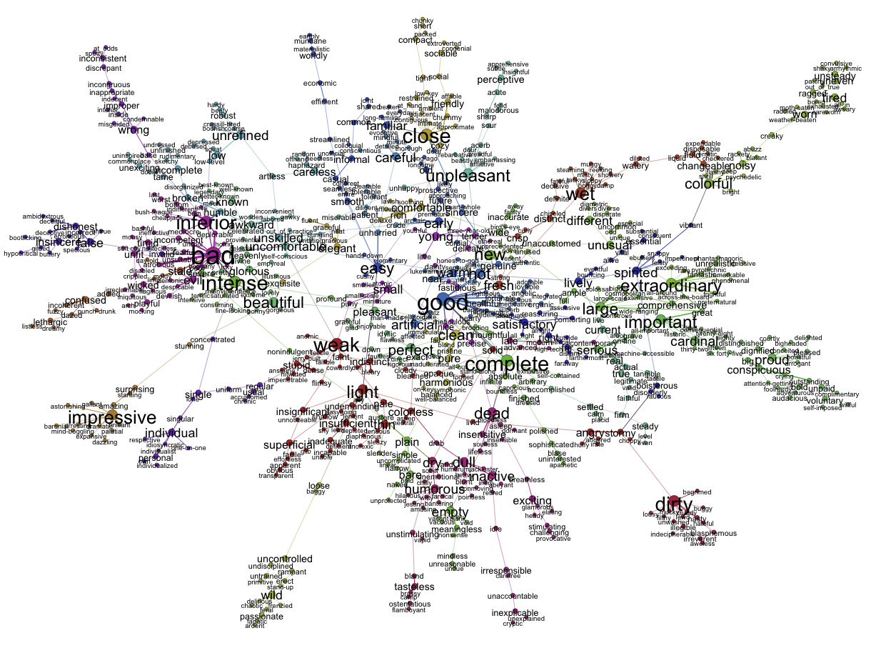
Figure fig:gephi uses the Gephi social networking program to graph the relationships between modifiers in WordNet as given by the similar-to graph.
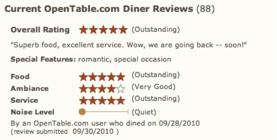
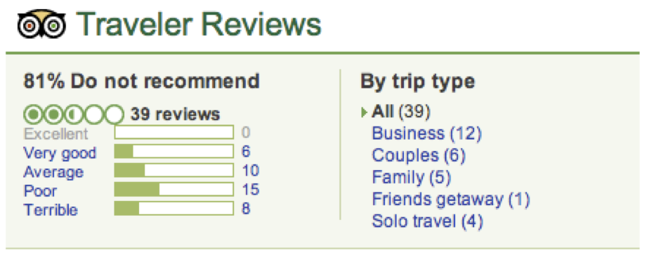
Many online retailers and social networking sites do an excellent job of summarizing rating information about specific products and services. I think the summaries in figure fig:ratingsum work particularly well.


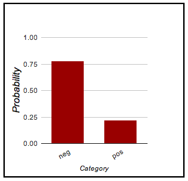
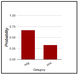
If you build a classifier model, I think it makes sense to provide similar distributional information, so that it is apparent not only what predictions your system makes but also where it is particularly certain or uncertain. Figure fig:predict provides some examples from the classifier demo.
| This movie was terrible! | This movie was amazing! | This movie was okay but a bit too long. |
|

|
|
Bing Liu often uses boxplot-like visualizations to compare products along a variety of dimensions. In figure fig:liu, this is particularly valuable, since reducing the comparison to a single number might be misleading, as each product has its own strengths and weaknesses (which individual users might care about at different levels).

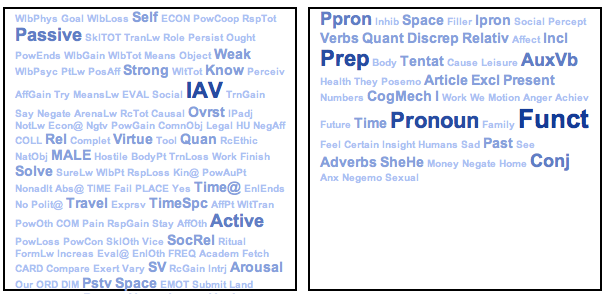
Finally, Wordle graphics are extremely popular these days. They usually represent the words in a text, with size corresponding to frequency (and the colors often randomly assigned). Figure fig:wordle does something slightly different: it visualizes a text as a cloud of semantic classes from the Harvard General Inquirer (left) and LIWC (right).
A cautionary note about Wordle: naive users tend to assume that the color choices are deliberate and that size corresponds to importance, a cognitively much deeper notion that frequency. (The practice of filtering very high-frequency function words encourages this misconception.)
Some accessible, open-source visualization toolkits: