Figure fig:imbalances
Imbalances in the distribution of texts
relative to categories. For the ratings corpora (panels 1-4),
positive dominates. For Experience Project, sympathy and
solidarity dominate.

Sentiment is highly variable and context-dependent. The goal of this section is to highlight some ways in which you can improve system performance by embracing this:
There can be enormous benefits to devoting time and resources to understanding your data and associated annotations before you start to build a sentiment model.
Figure fig:imbalances summarizes one of the major challenges to sentiment systems trained on naturalistic annotations like star-ratings: it is almost invariably the case that some categories are vastly over-represented. (This section is largely about getting around this problem when building lexicons.)
For many applications, you will want to reduce the dimensionality of your label set.
If you have hundreds of labels, then consider building a word × label matrix using the techniques in the vectors section and then seeing if you can effectively combine columns.
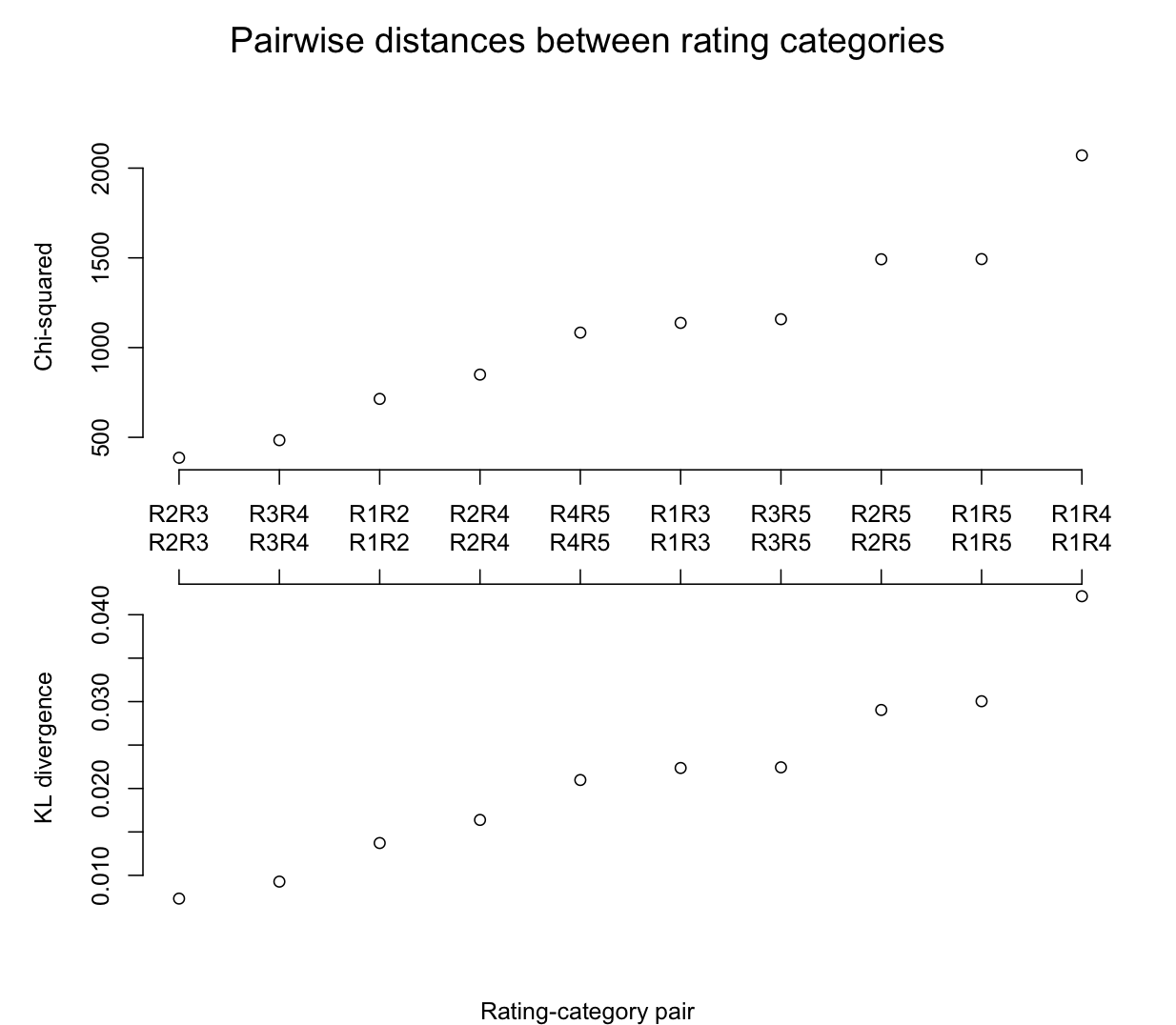
For smaller category sets like star ratings, you might want to directly measure the distance between them, to see if natural divisions emerge. Figure fig:dist uses two probabilistic methods for making such comparisons for a five-star rating system. Strikingly, it looks like a natural division would be a three-way one grouping the entire middle of the scale against its edges.
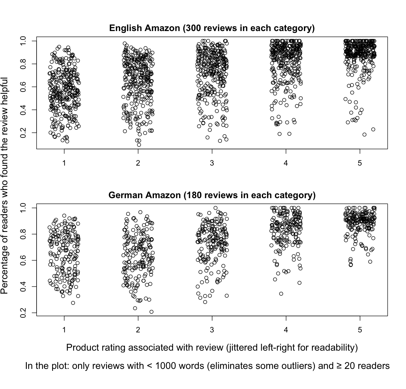
Although star-rating systems are by now widely understood, we might still worry that some users are confused. For example, in many parts of Europe, 1 is the best mark one can get in school, and this seems to lead some users to pick 1-star when giving very positive reviews. Figure fig:textrating is reassuring, though: it shows a high correlation between intuitive natural language phrases and star ratings.

The star rating is primarily an indicator of the speaker/author vantage point. However, there is good reason to believe that readers/hearers are able to accurately recover the chosen star rating based on their reading of the text. Potts (2011) reports on an experiment conducted with Amazon's Mechanical Turk in which subjects were presented with 130-character reviews from OpenTable and asked to guess which rating the author of the text assigned (1-5 stars). Figure fig:mturk summarizes the results: the author's actual rating is on the x-axis, and the participants' guesses on the y-axis. The responses have been jittered around so that they don't lie atop each other. The plot also includes median responses (the black horizontal lines) and boxes surrounding 50% of the responses. The figure reveals that participants were able to guess with high accuracy which rating the author assigned; the median value is always the actual value, with nearly all subjects guessing within one star rating.

The environment in which the text was produced can impact sentiment in complex ways.
The observational fact is that the more reviews a product gets, the more consistent the ratings, and the more positive those ratings are. Figure fig:ratingproduct summarizes for a few different corpora.
There is an intuitive explanation for this: a few bad reviews is enough to stop people from buying, which in turn leads them to stop reviewing. Conversely, positive reviews stimulate people to buy, which in turn increases the reviewer pool. (Movies and video games are somewhat exceptional in this regard. Both are products that many people buy immediately, sight unseen.)

Helpfulness ratings are predictors of sentiment, as seen in figure fig:helpful. I am not sure why this is, exactly, but its seems to be a very robust effect (Ghose, Ipeirotis, and Sundararajan 2007; Danescu-Niculescu-Mizil, Kossinets, Kleinberg, and Lee 2009). One factor that likely contributes is that online retailers tend to promote very positive reviews, which means they are read more than others.
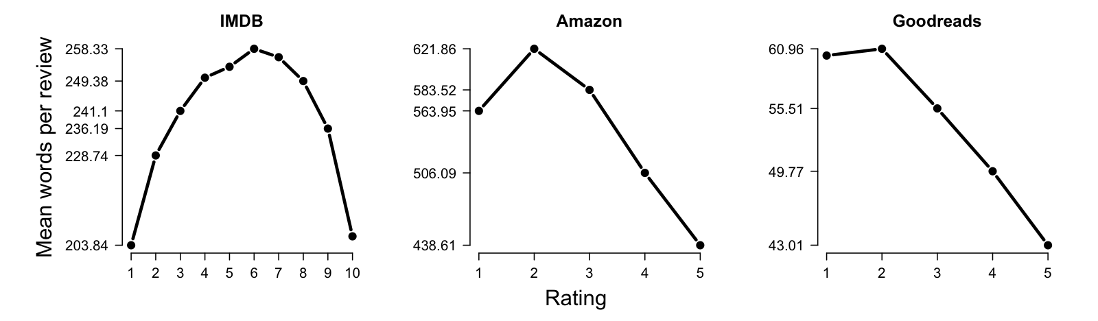
Text length is another useful predictor (figure fig:lengths). Short texts tend to be highly emotive (positive or negative). Longer texts tend to be balancing perspectives, so they are longer on average.
Authorship follows the a Zipfian pattern: most authors contribute one or two texts, and a handful contribute huge numbers of texts. Overall, user-level modeling can sharpen the overall picture.

Individual reviewers tend to give the same ratings repeatedly (figure fig:rev_sd).

This pattern probably arises because reviewers simply use different parts of the scale: some very kind reviewers never dip below three stars no matter how much they dislike the product, whereas give our stars much more grudgingly. If this is the case, then it might pay off to z-score normalize the ratings of individual authors before you use them:
The population for a score could be the set of a reviewer's scores, or the scores for a product or product class, or the entire corpus.
Though individual raters tend to confine themselves to a small part of the scale, raters differ from each other quite considerably. Figure fig:rev_cmp supports this claim in a rather controlled way, by comparing nine users who all rated the same seven books on Amazon.

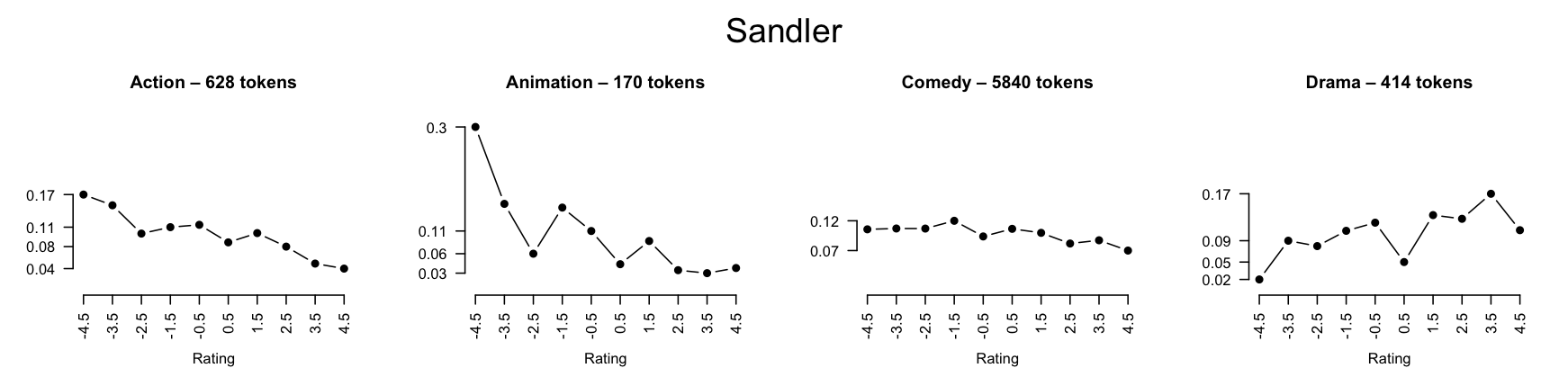
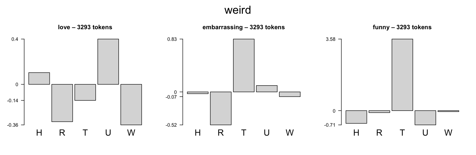
Reviewers also use language differently from each other, so the more you can model these differences, the more accurate your analysis will be. Figure fig:damn illustrates with a rather intuitive example concerning how people use curses.

What you're talking about has a profound effect on the language you use. Thus, if you have topical information (forum name, product, product class, etc.) it should be included in your model. Figure fig:genre shows some quick, intuitive examples of variation by movie genre in IMDB reviews, using the techniques described in the review lexicon section.


Similarly, confessions at the Experience Project are tagged with group information, and these provide valuable clues as to how to understand the language (figure fig:groups).

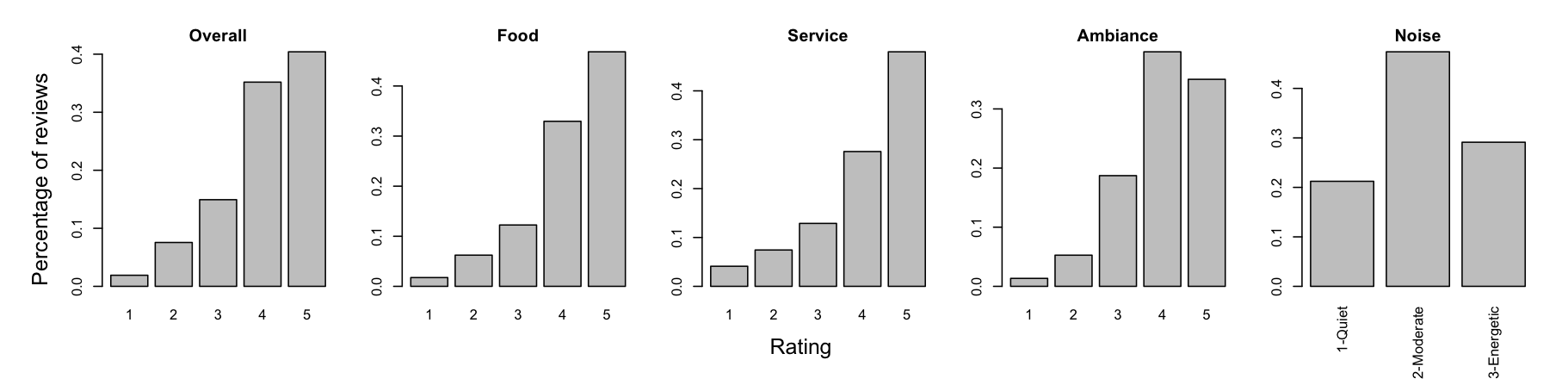
Some sites have aspect-level metadata which can facilitate learning specific topic-level associations. Unfortunately, in my experience, the aspect-level ratings tend to be highly correlated with each other and with the overall rating, which detracts from their usefulness. The situation on OpenTable, summarized in figure fig:aspect and figure fig:diff, is typical.

The ratio of positive to negative words as defined by a quality sentiment lexicon might be an indicator of the true sentiment of the text, in that extreme values are likely to be instances of thwarted expectations.
| i had been looking forward to this film since i heard about it early last year , when matthew perry had just signed on . i'm big fan of perry's subtle sense of humor , and in addition , i think chris farley's on-edge , extreme acting was a riot . so naturally , when the trailer for " almost heroes " hit theaters , i almost jumped up and down . a soda in hand , the lights dimming , i was ready to be blown away by farley's final starring role and what was supposed to be matthew perry's big breakthrough . i was ready to be just amazed ; for this to be among farley's best , in spite of david spade's absence . i was ready to be laughing my head off the minute the credits ran . sadly , none of this came to pass . the humor is spotty at best , with good moments and laughable one-liners few and far between . perry and farley have no chemistry ; the role that perry was cast in seems obviously written for spade , for it's his type of humor , and not at all what perry is associated with . and the movie tries to be smart , a subject best left alone when it's a farley flick . the movie is a major dissapointment , with only a few scenes worth a first look , let alone a second . perry delivers not one humorous line the whole movie , and not surprisingly ; the only reason the movie made the top ten grossing list opening week was because it was advertised with farley . and farley's classic humor is widespread , too . almost heroes almost works , but misses the wagon-train by quite a longshot . guys , let's leave the exploring to lewis and clark , huh ? stick to " tommy boy " , and we'll all be " friends " . |
Suggestion: create a real-valued feature that is the Pos:Neg ratio if that ratio is below 1 (lower quartile for the whole PangLee data set) or above 1.76 (upper quartile), else 1.31 (the median). The goal is to single out "imbalanced" reviews as potentially untrustworthy at the level of their unigrams. (For similar idea, see Pang, Lee, and Vaithyanathan 2002.)
The above is just a sample. Any contextual information you can get your hands on will be valuable. Here's a sample of others that you're likely to be able to bring into a real-world system with relative ease.